BACKGROUND
RESEARCH PHASE
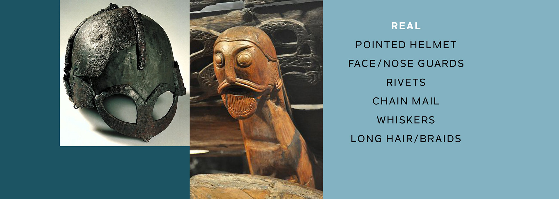
We all think we know what a Viking looks like, but do we?
For this character, I never felt fully restrained by historical accuracy, but I did want to get a sense of what was real and what was not. My research provided some dead ends, but in equal amounts, useful inspiration.
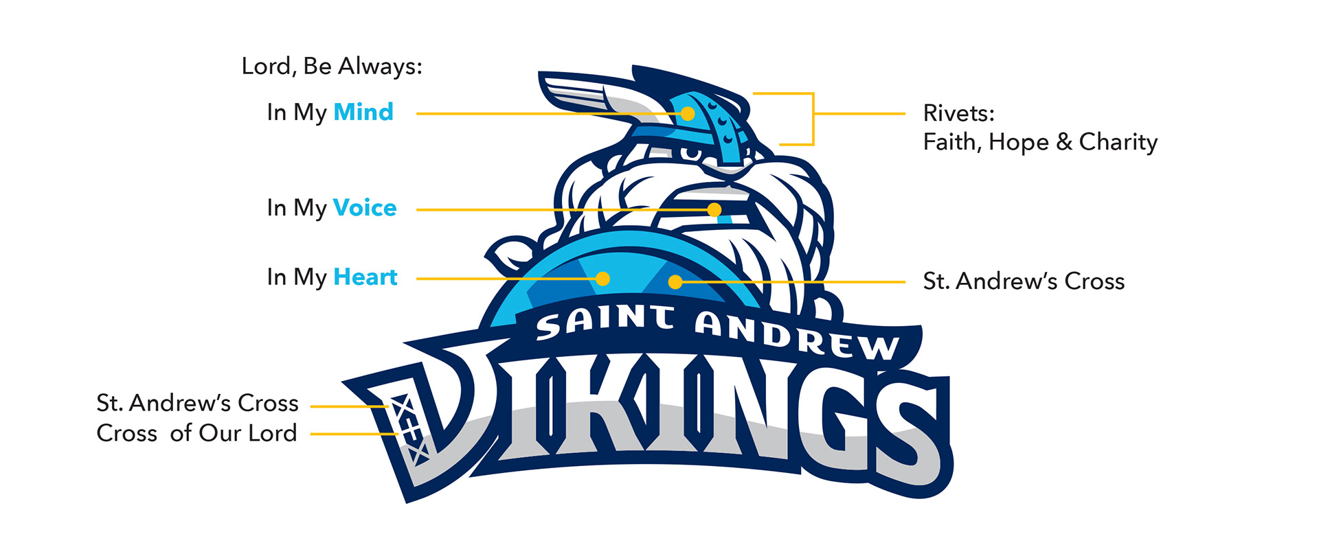
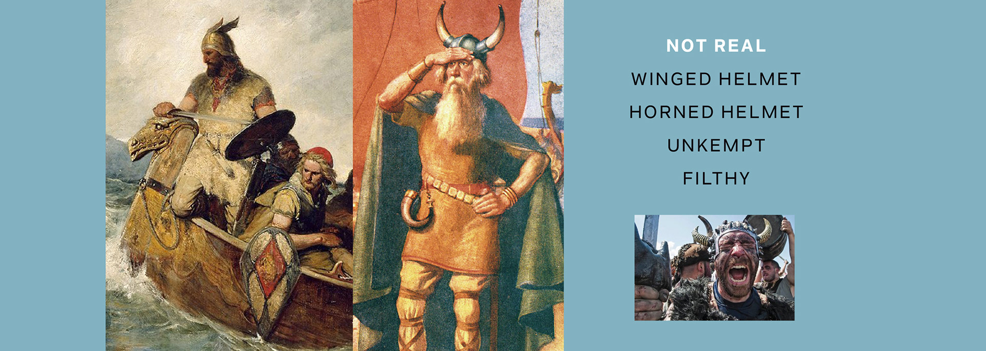
Once I found that a horned helmet had no historical advantage over a winged helmet, I opted for the one that was more angelic-looking.
A Viking is a problematic mascot for a Catholic institution. Not particularly well-remembered for turning the other cheek, Vikings were skilled craftsmen, explorers and mariners, but they were also plunderers and warriors.
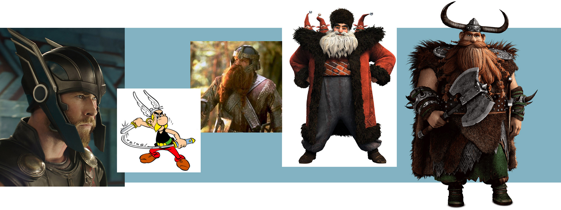
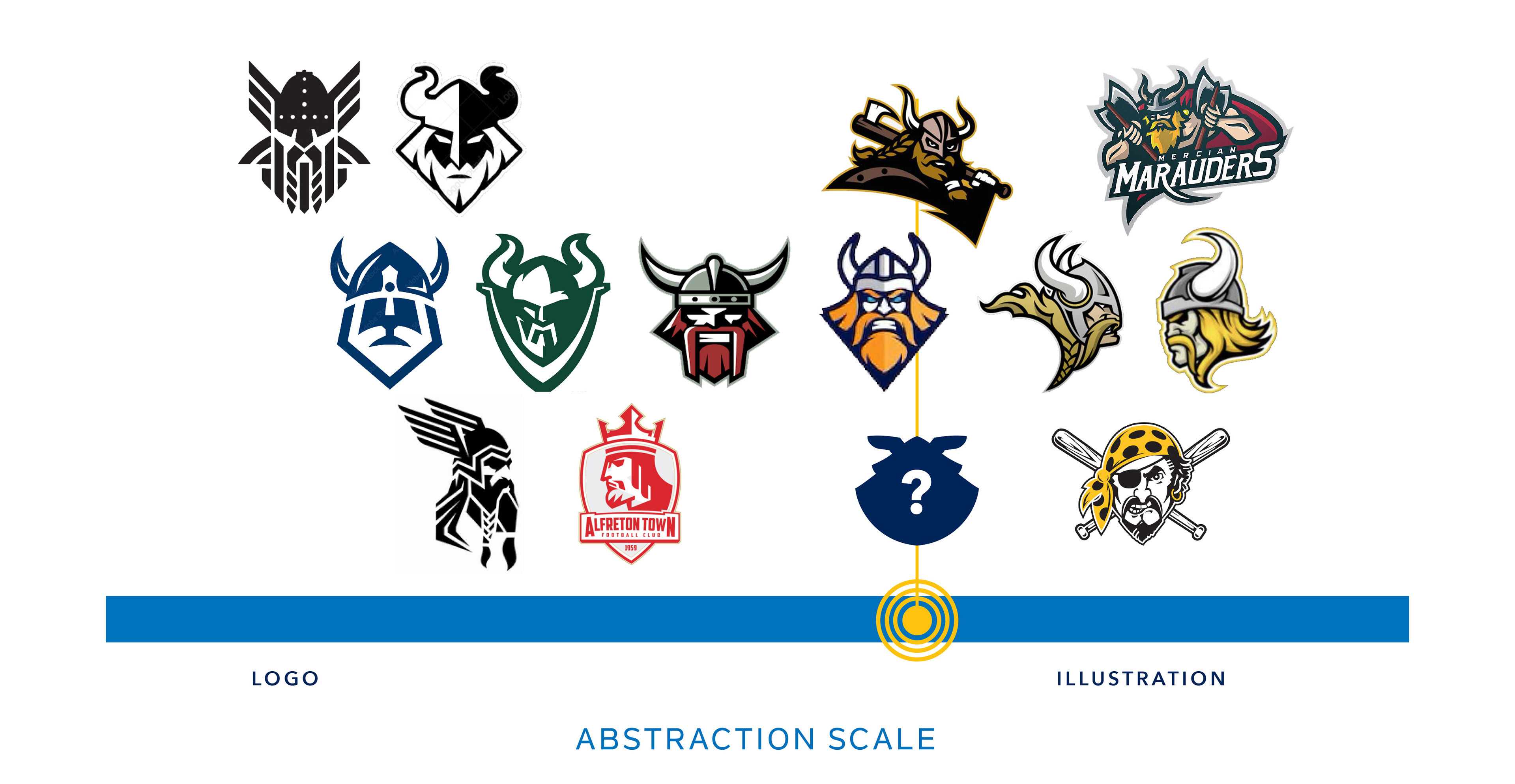
Finding that sweet spot between hero and bully was the real trick, and I surveyed pop culture to see if winged helmets could really look cool—or if crazy beards were really too scary.
So what does a Catholic Viking look like? History gave me one answer:
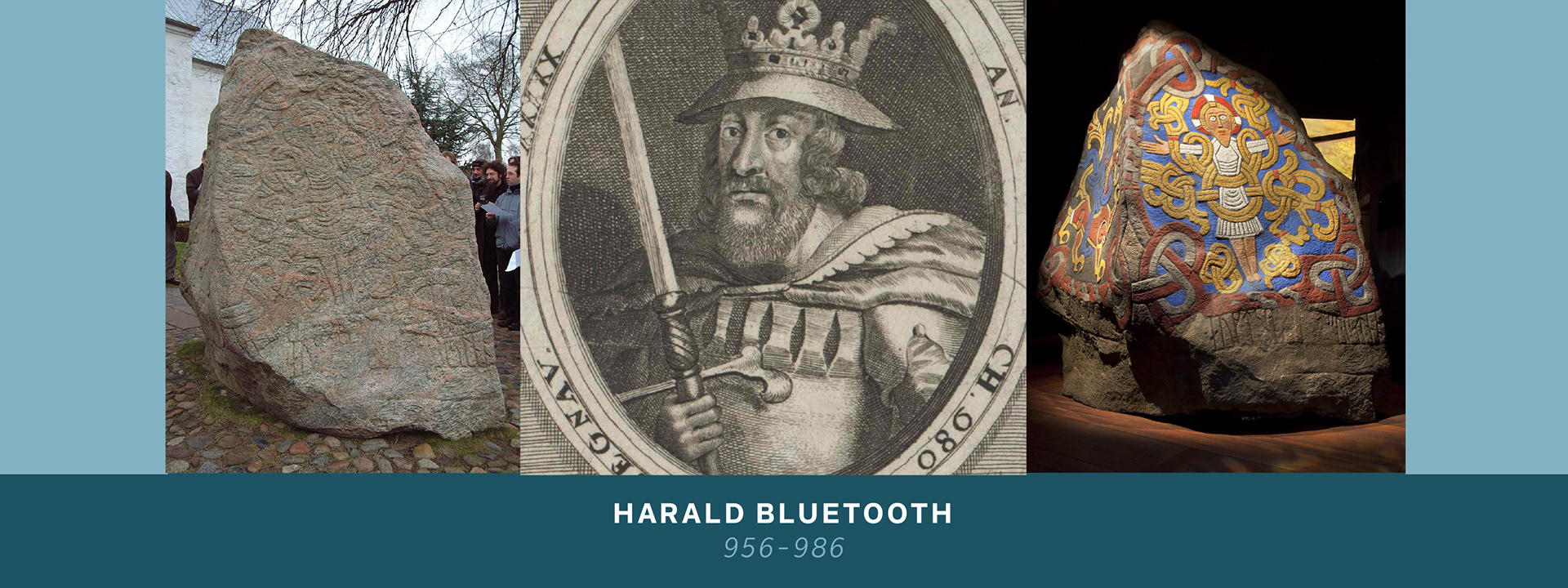
Harald Bluetooth was a Norse king and warrior who united most of the Northern world under Christianity. He is a symbol of unity and connectedness, which is why our current Bluetooth technology is named after him.
The Norse monuments known as Jelling Stones were created under Harald Bluetooth, and display the double-ribbon design that was incorporated into the school logo.
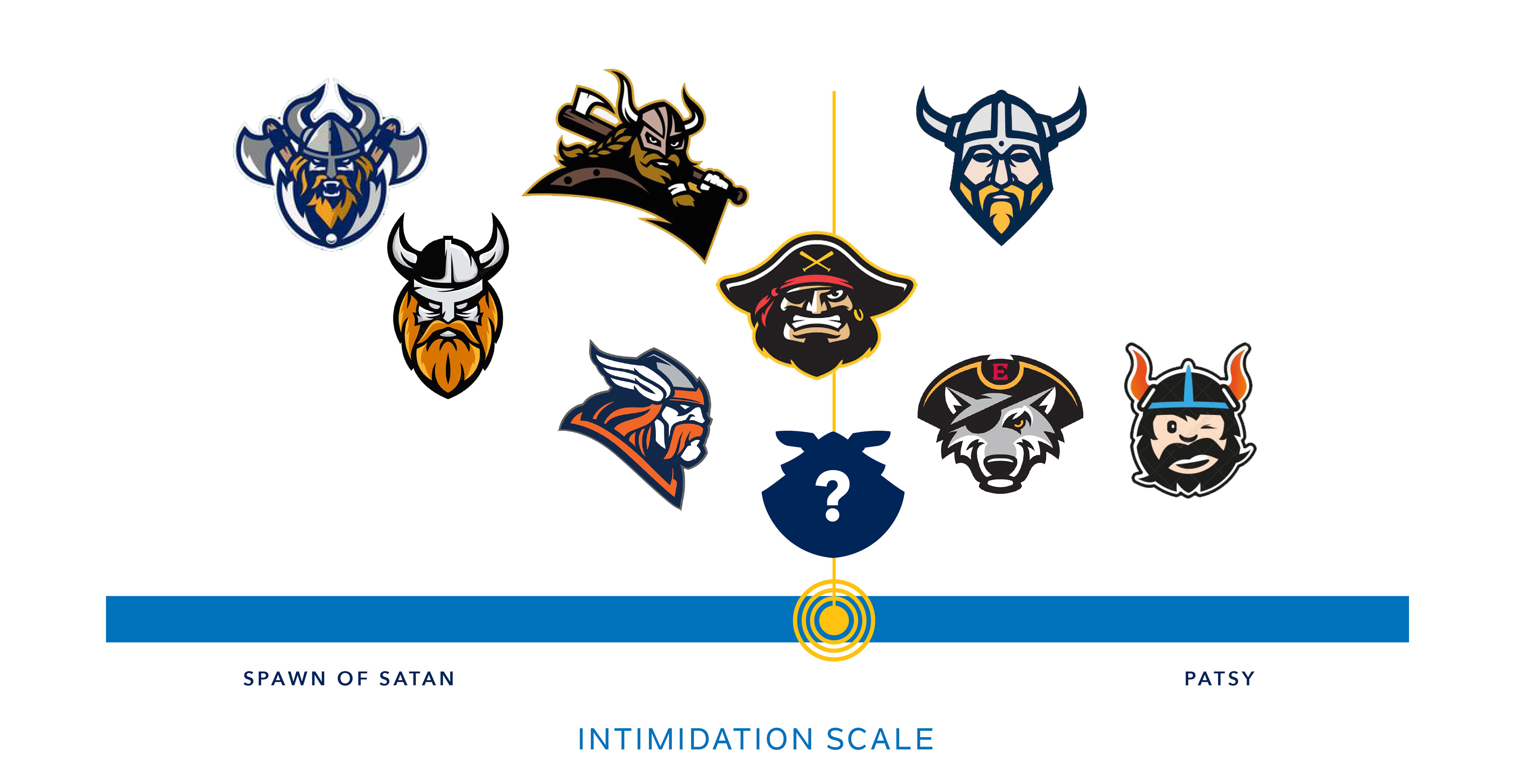
Every sports mascot needs a certain amount of moxy, but a Catholic school mascot ought to exemplify traditional virtues.
He needs to be formidable, but not a bully or thug.
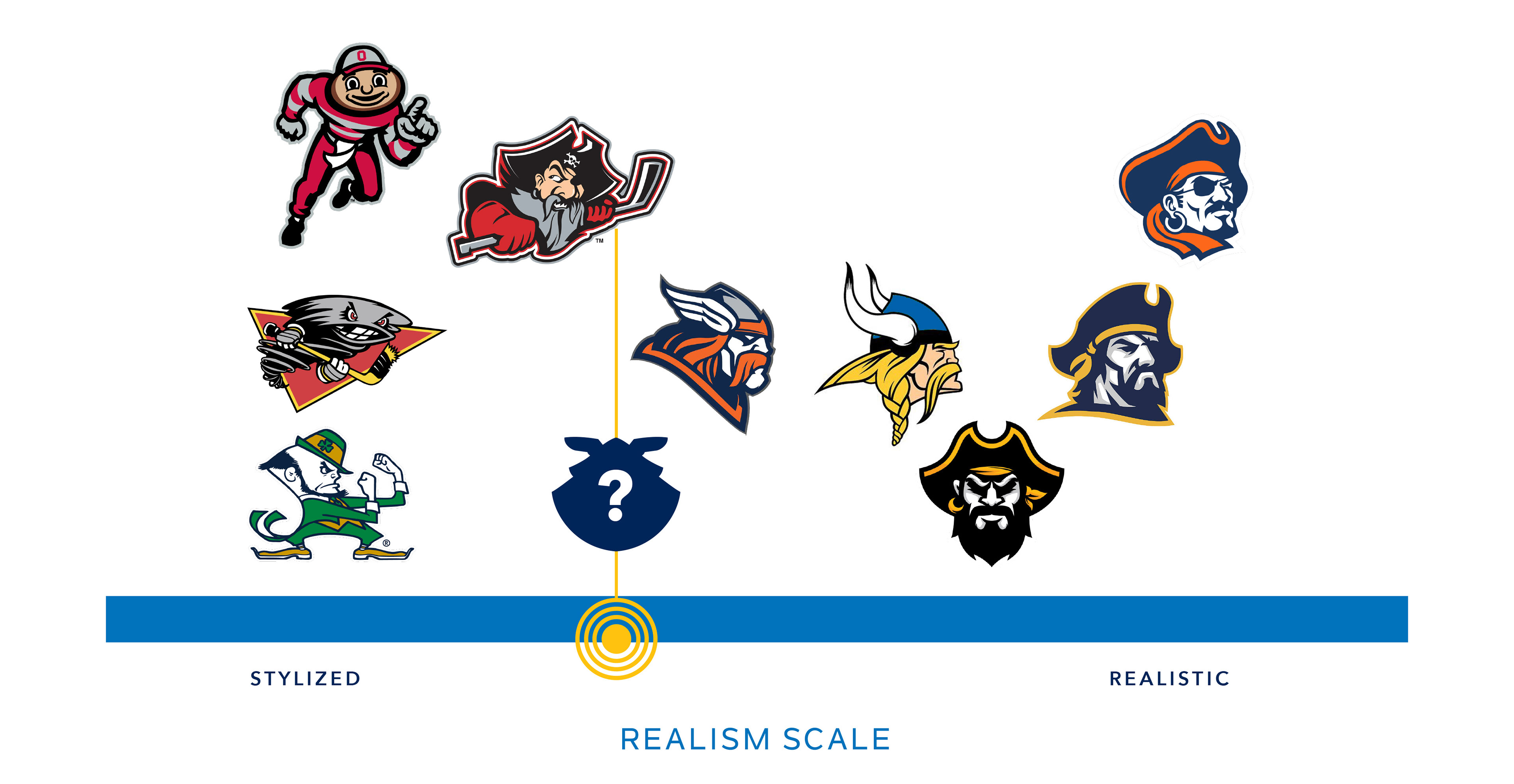
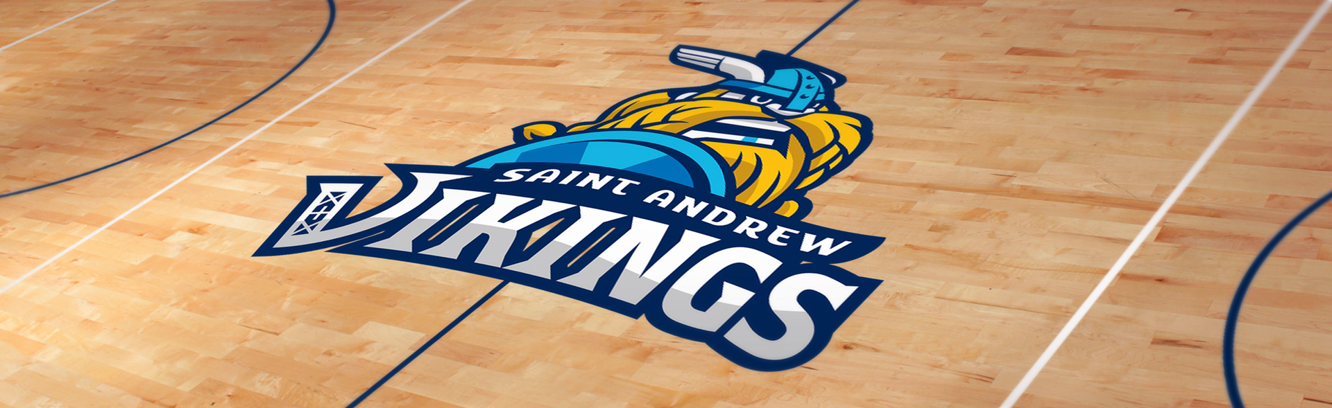
Moving away from humanlike proportions seemed a natural choice for our young audience. It also helps to steer clear of the single best-known Viking in sports.
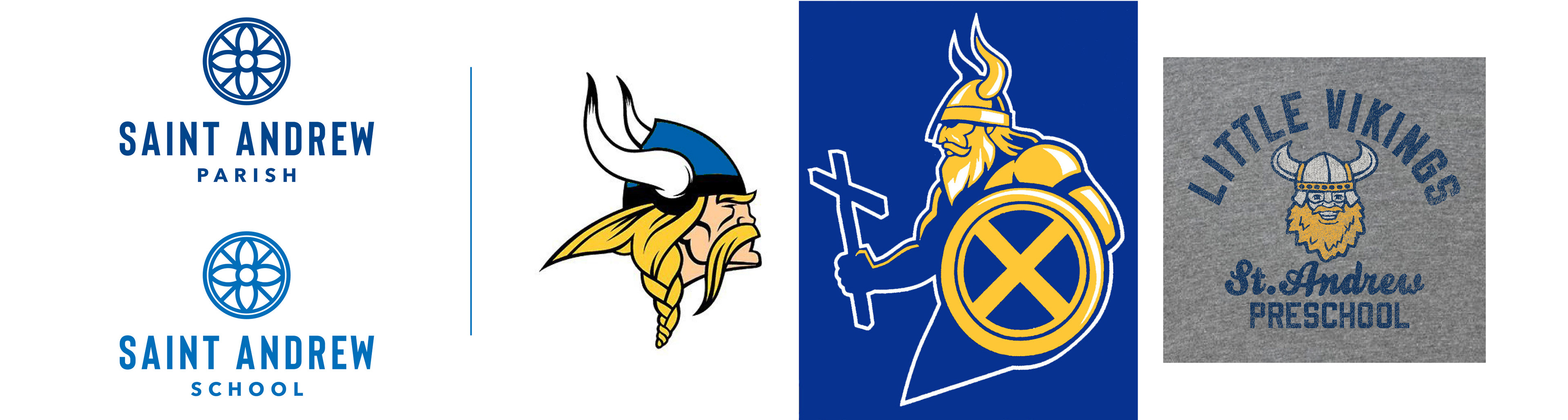
Because the school logo has a pretty corporate look, I wanted to establish a real contrast with the athletic graphics.
After all, what's the fun of having a spirit day, if your spirit wear looks like your school uniform?
SKETCH PHASE
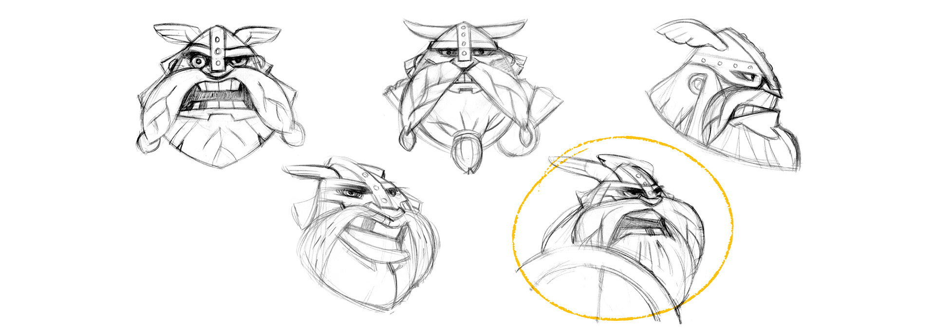
Early sketches: trying to establish personality
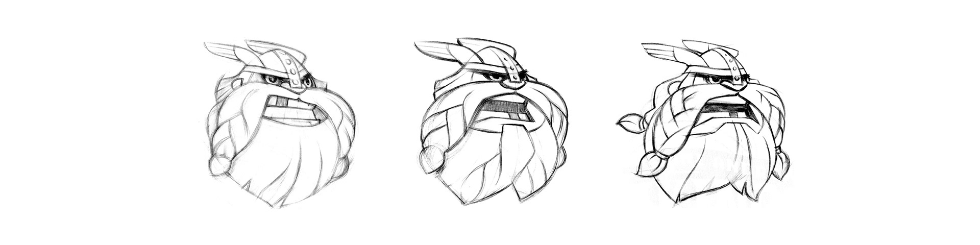
Refined sketches with variations on teeth and hair.
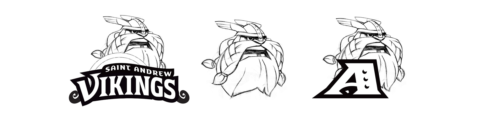
Refined sketches: Integrating the Viking character with typography
TYPOGRAPHY
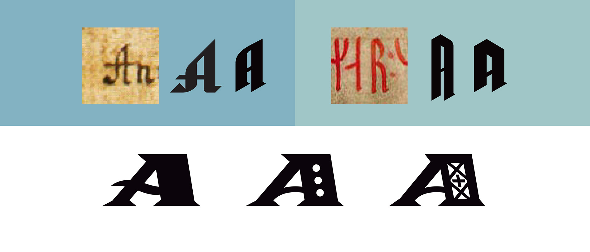
I had hoped to inject a bit of Norse history into the typography, creating letterforms inspired by Nordic runes and manuscripts.
In the end, these just didn''t have the strength needed—or they lost their historic flavor when I beefed them up.
I settled on a contrasty Roman "A" with embellishents that referenced waves, rivets and Viking woodcraft.
VARIANTS
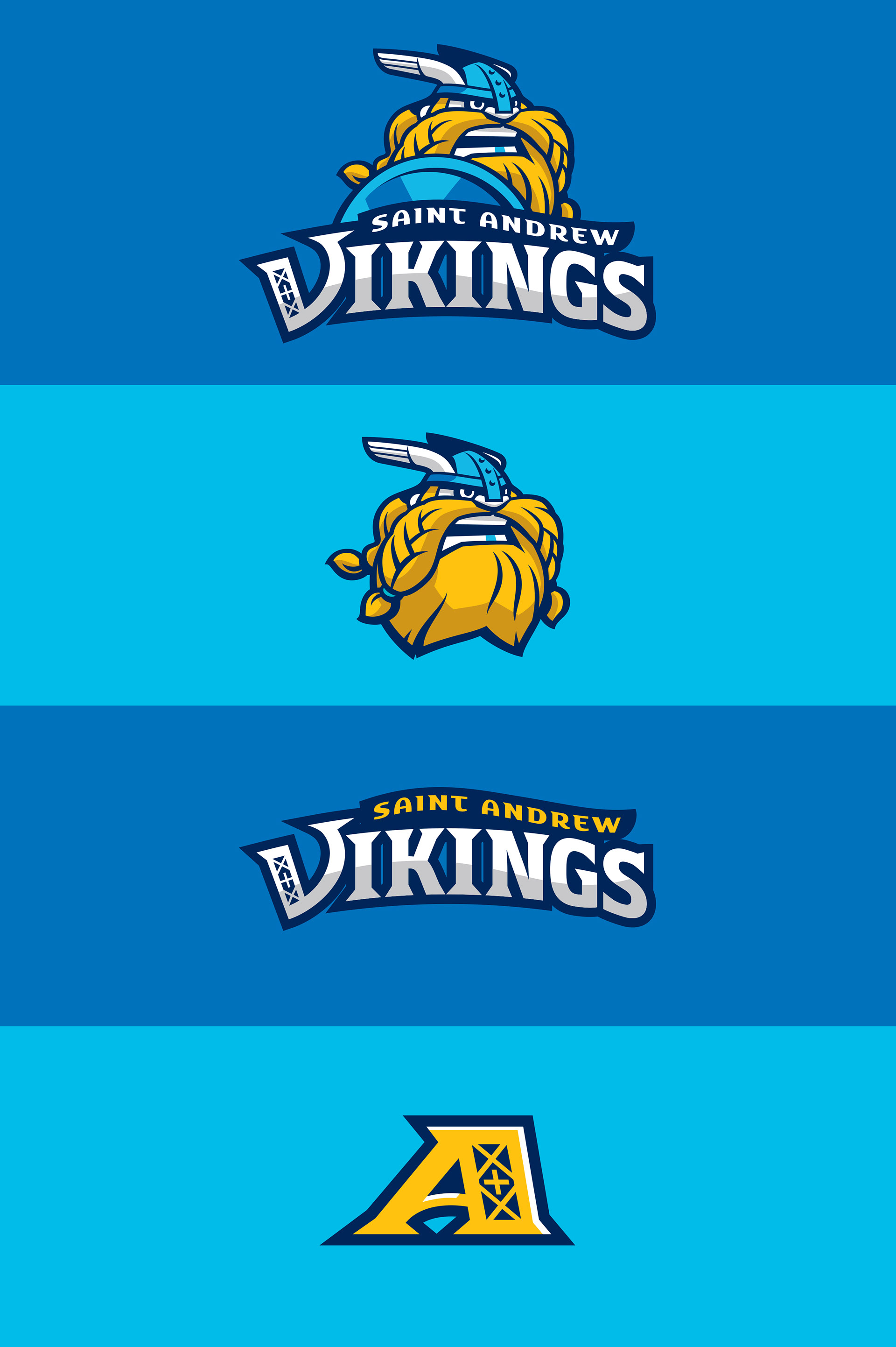
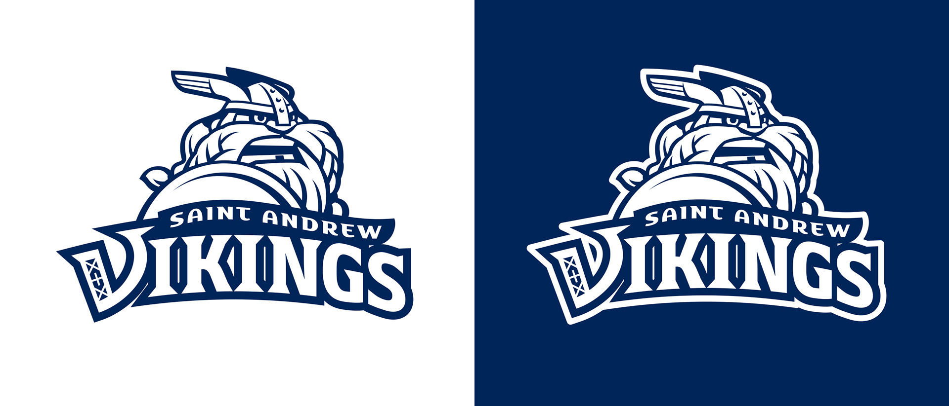
Primary Logo — one-color and reversed versions
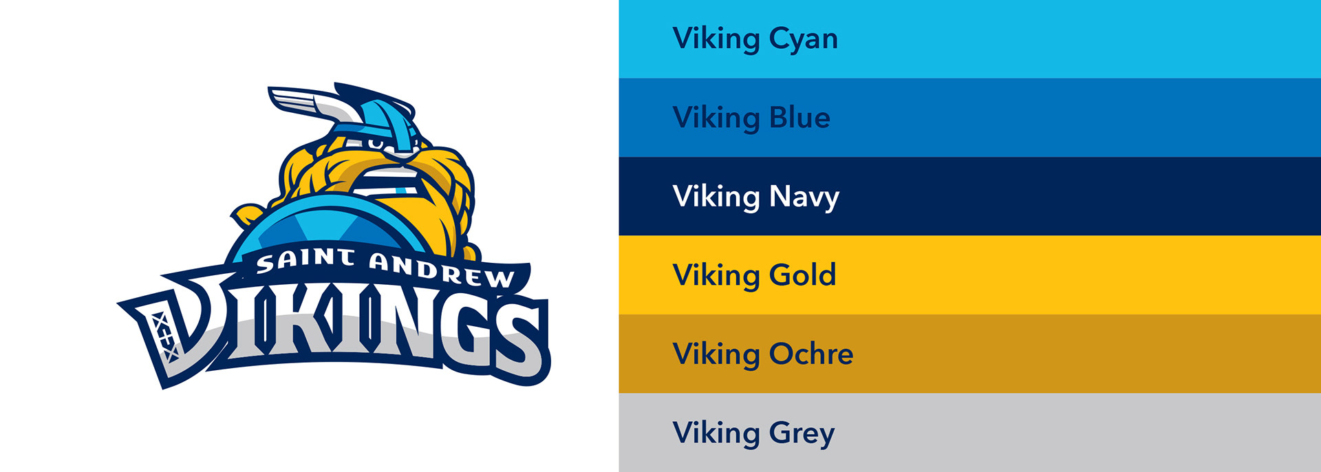
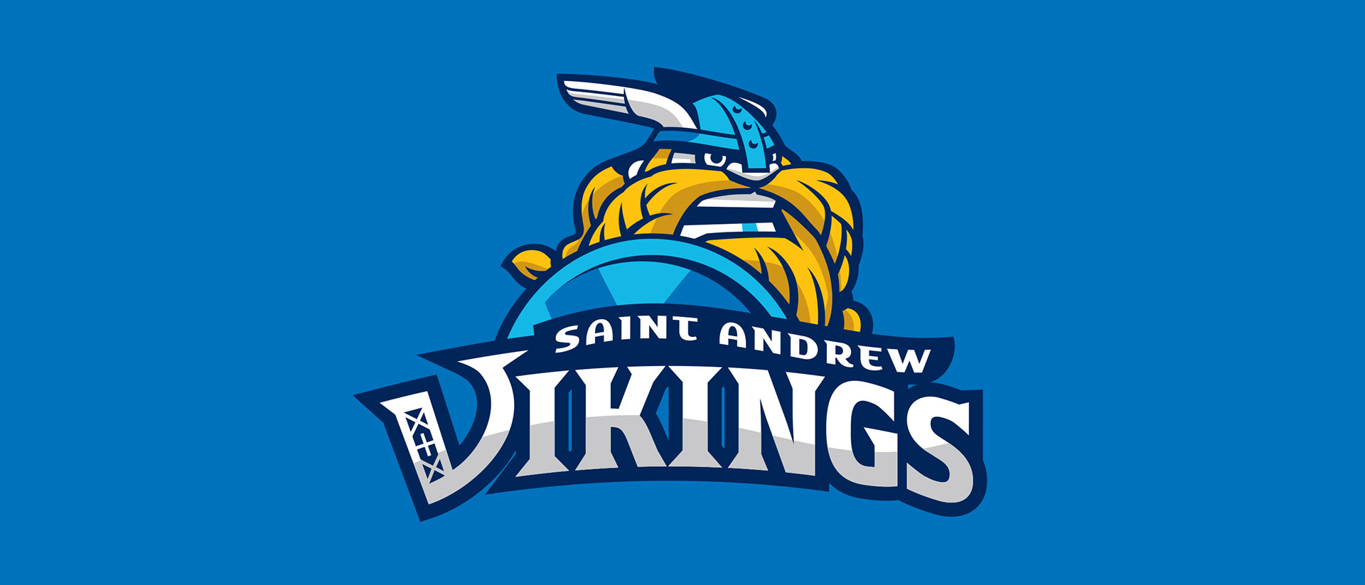
Saint Andrew's school colors have always been blue and gold. I felt that we could expand the palette to give all our branding more flexibility while still respecting that traditional 2-color scheme.