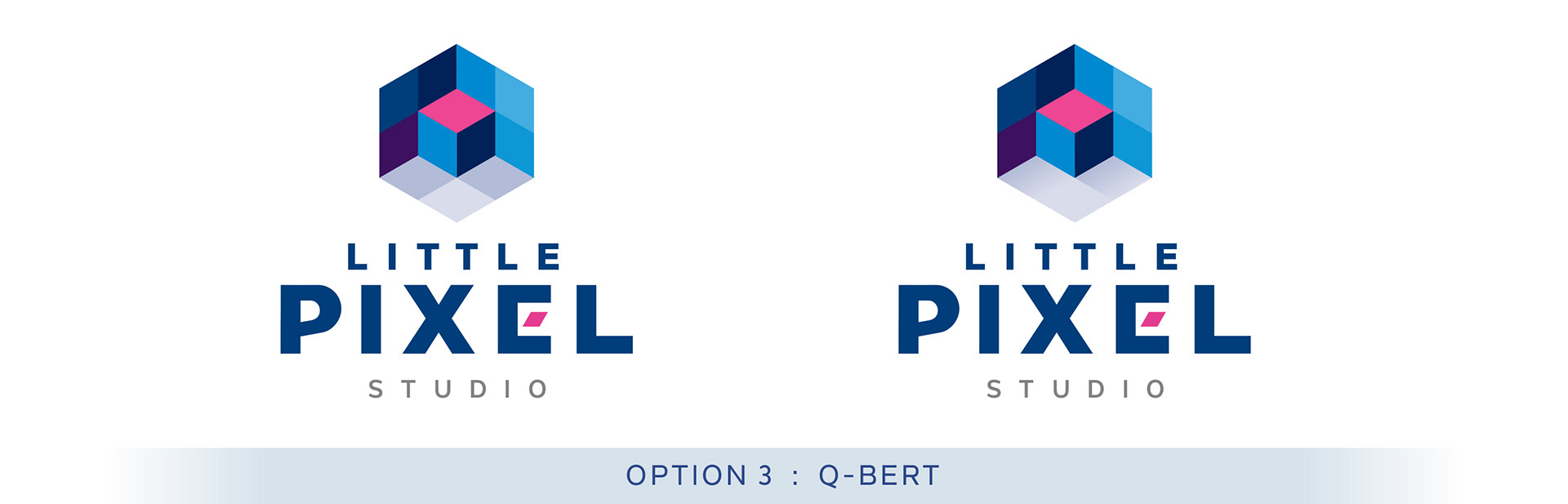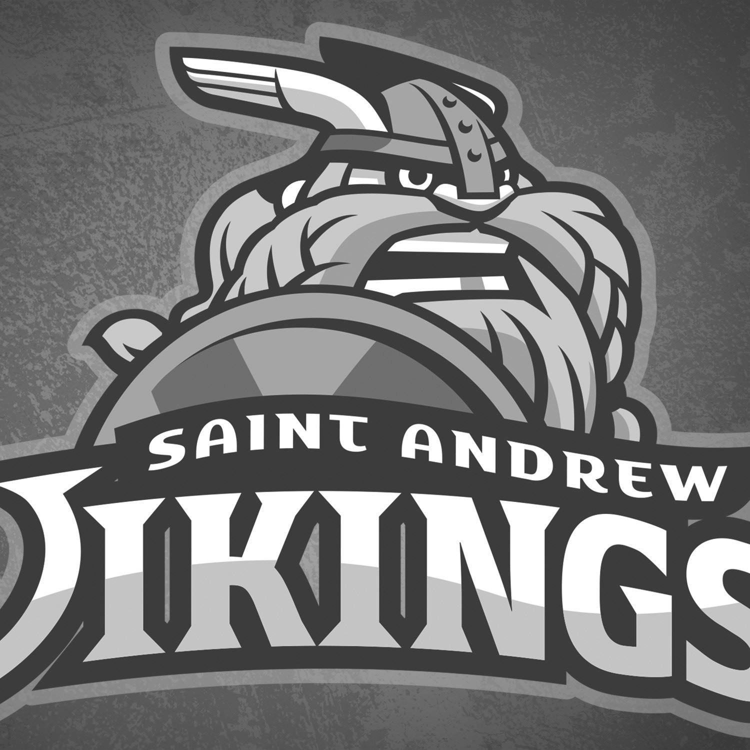
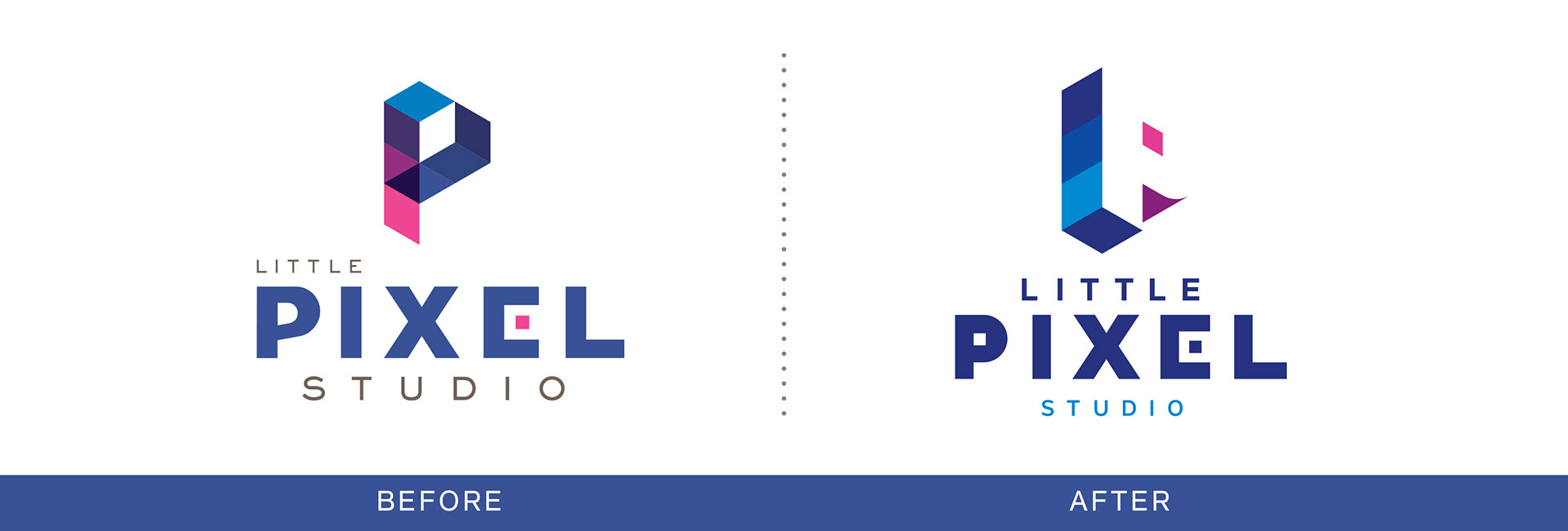
Little Pixel Studio came to us with a logo that had a lot going for it. It had a dimensional quality, transparency effects, and utilized isometric forms—all hallmarks of the company's trade. It also had a few too many ideas competing in the lockup, and needed simplifying for legibility.
Problem: Refresh the brand, emphasizing the company's core strengths, while giving maximum clarity to the wordmark.

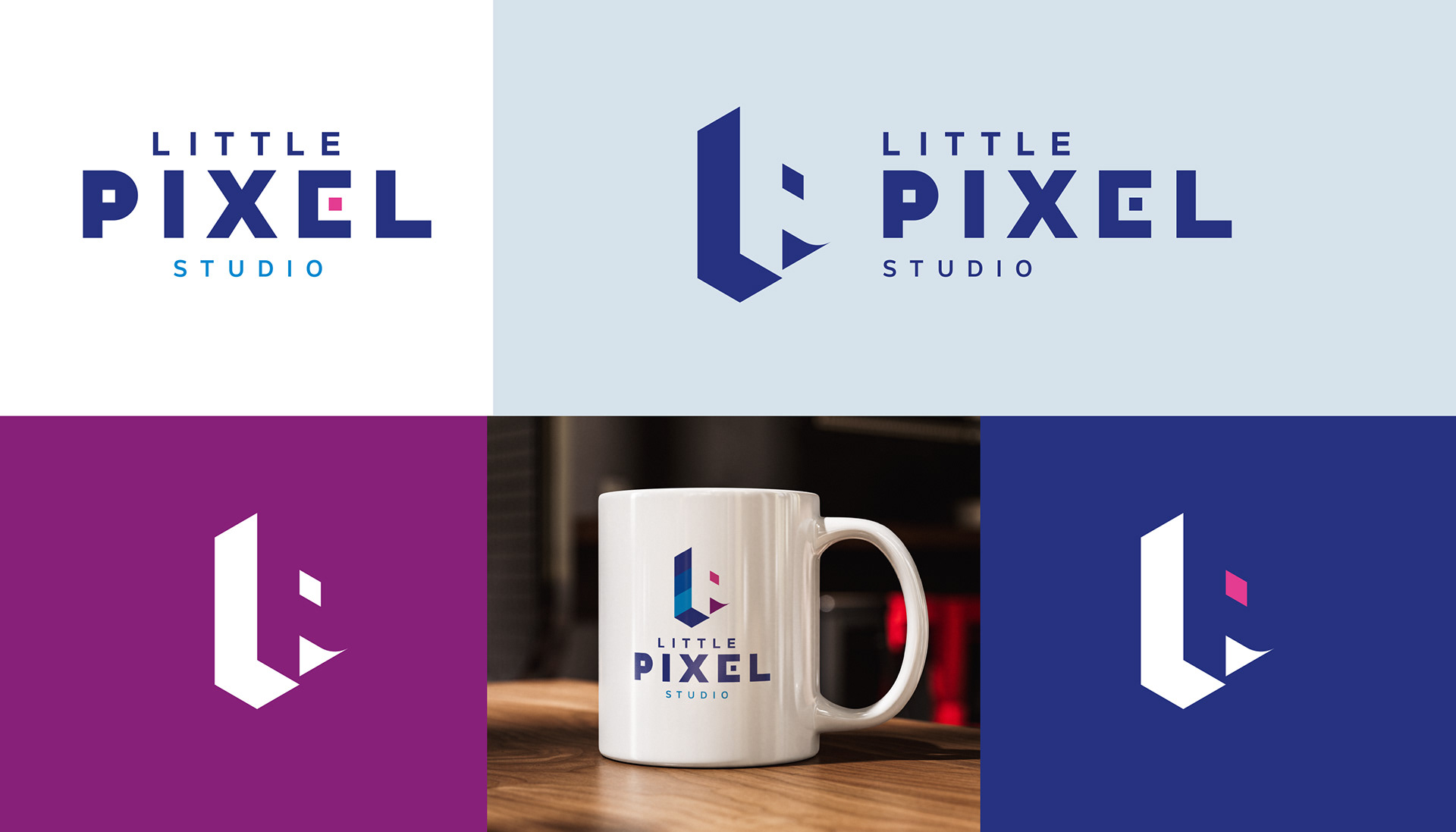
In the redesign, I altered the POV to make the P appear more heroic. Despite this, the little pink pixel is still the star: isolated and doing most of the work turning negative space into an unmistakable P monogram!
P R O C E S S
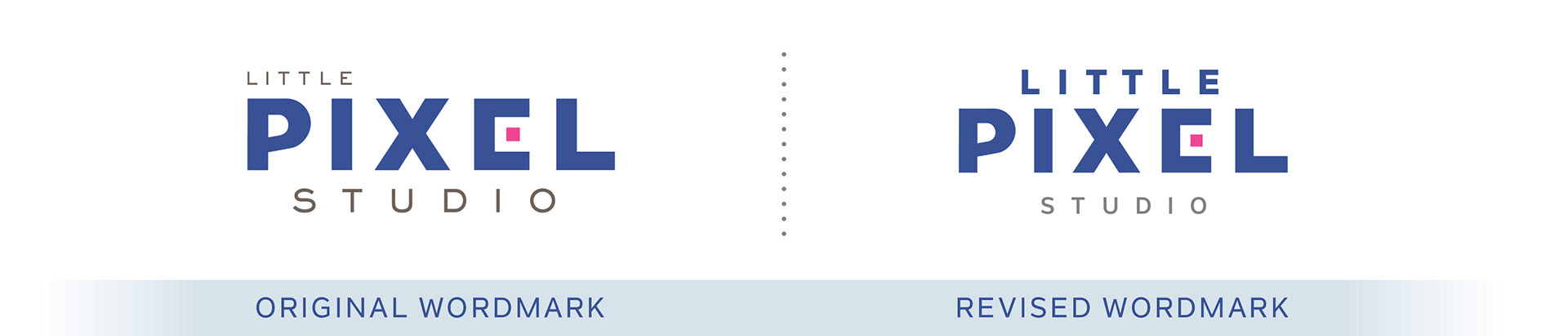
My client wanted to keep the existing color scheme for continuity. I adjusted the wordmark to properly communicate the business' name. Once that was reading properly, we concentrated on the primary mark.
We agreed to try a monogram with both initials, as well as an option or two that were flat.