St. Andrew School had a wonderful reputation for preparing its students well for the rigors of high school. It also faced fierce competition from excellent local public and private schools.
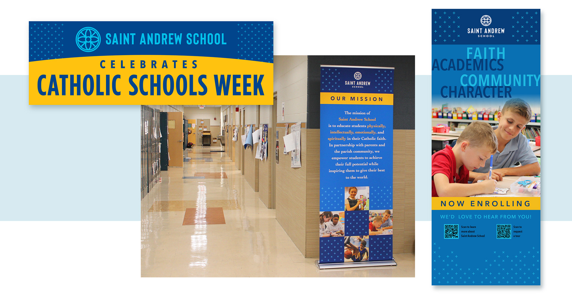
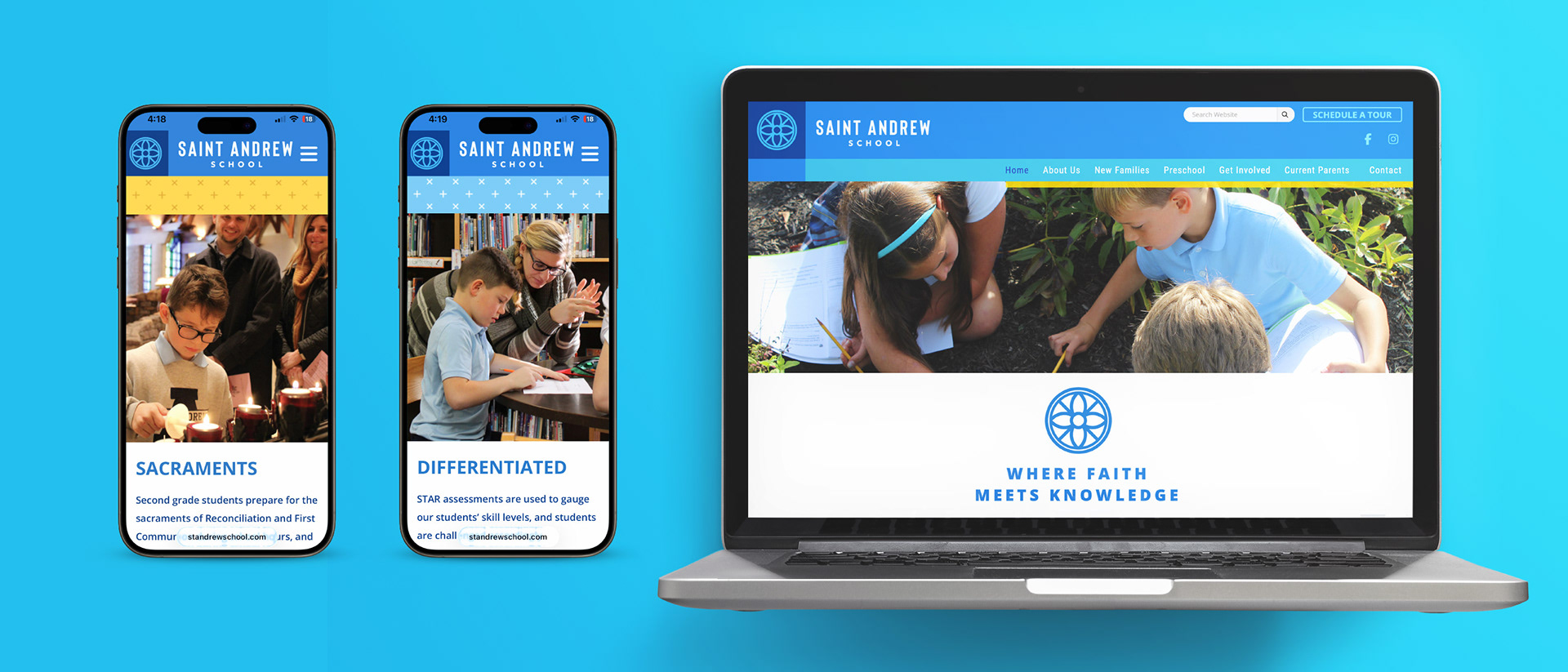
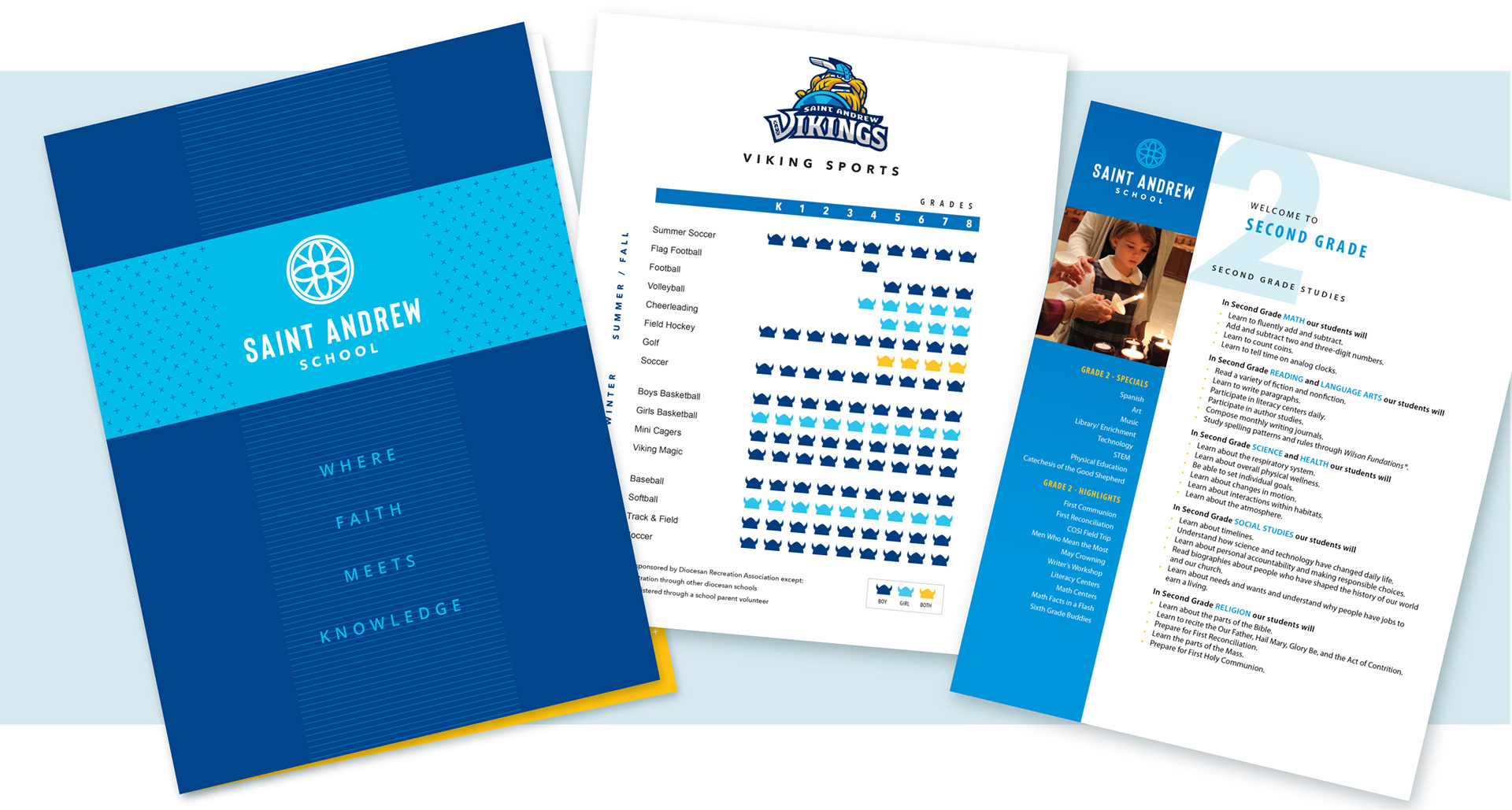
My aim was to refresh the image of the school, emphasizing its ties to the larger parish family, and tell an ongoing story of a vibrant academic community diversified in all the right ways, but joined as a family of joyous faith.


I created several options of logo families that connected the parish and school with their respective buildings.
The parish staff opted to adopt one mark that would represent them all.

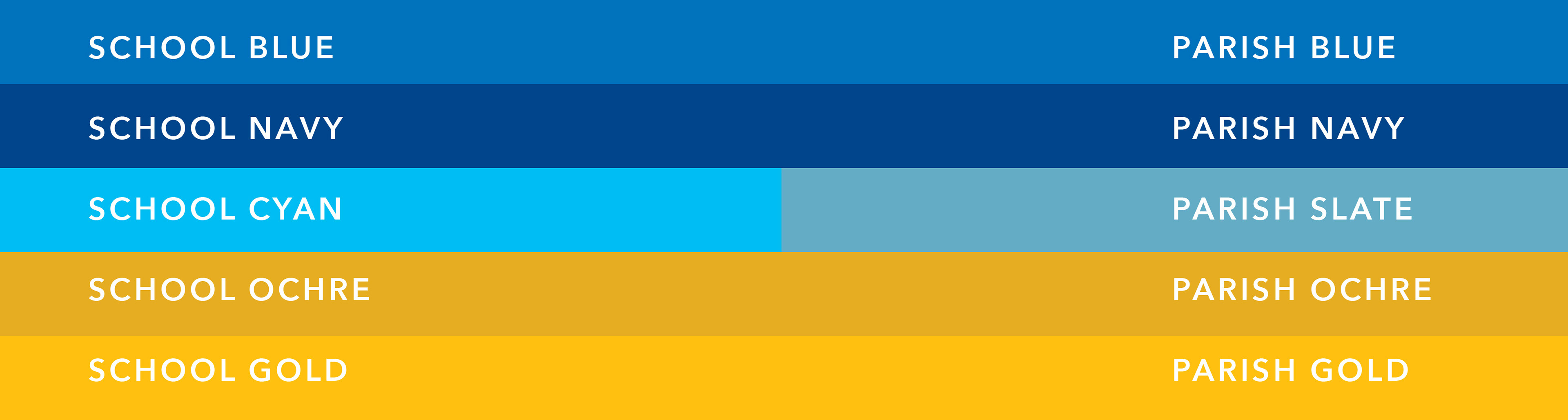
The school colors are blue and gold. I expand the way "blue and gold" was expressed by adding tertiary colors to the palette. This approach lends flexibility to the system, and mimics the palettes used by preschools that are familiar to families entering kindergarten.

Patterns add texture and charm, and distinguishes the school's branding from the parish's.